Understanding a WindNerd Station Page
Every station page shows the same wind data in six complementary ways, from "right now" to "what this spot is like in July". This guide explains how to read each one.
The basics
These conventions apply everywhere on the page:
-
Colors mean speed. Every colored element (badges, arrows, curves, even the drifting particles) uses the same scale: gray for calm, through cyan, blue, green, yellow, orange, red, up to magenta/purple for extreme wind. Once you know the scale, you can read wind strength at a glance without reading a single number.

Notice the scale is not linear: most of the color changes happen in the light-wind range, so small differences at low speed are easy to see, while the top end (storm and beyond) compresses into red and purple.
-
Arrows point where the wind is going. A north wind (wind from the north) is shown as an arrow pointing down/south. The direction badge gives the same information as text: degrees plus a compass point, e.g.
315° NWmeans wind coming from the northwest.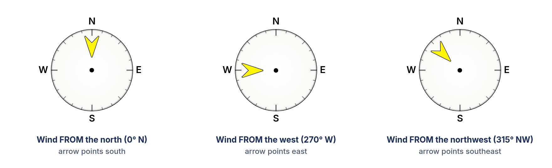
-
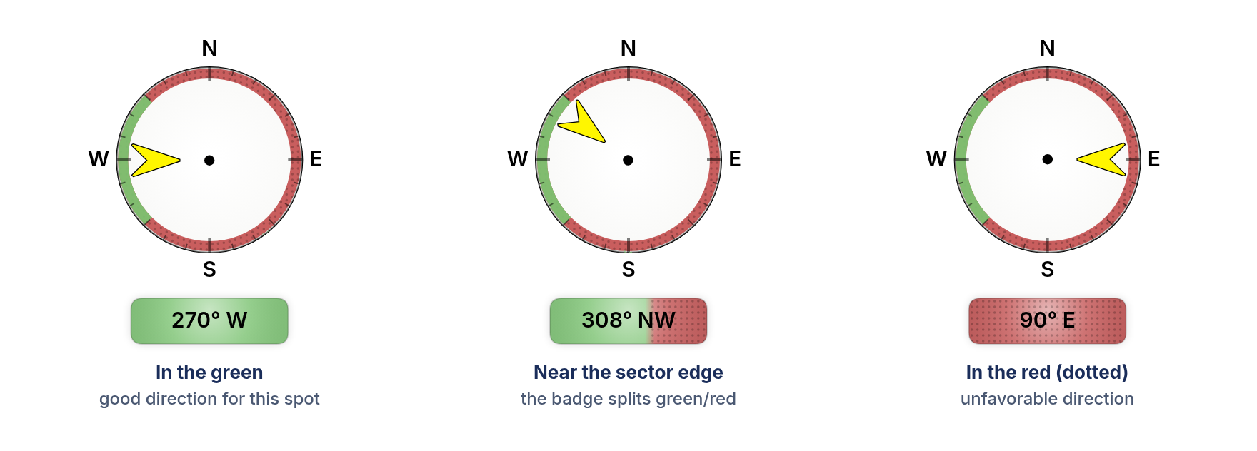
Green and red rings/badges: is this direction good here? Stations tied to a spot (a paragliding takeoff, a kite beach, an airstrip…) can declare which wind directions work for that spot. Wherever you see green, the current direction is favorable; red means unfavorable. Red areas also carry a subtle dot pattern so the split stays visible if you have trouble telling red from green.
-
Your units. All speeds respect the unit you picked in your settings (km/h, m/s, mph or knots); the chosen unit is saved in your browser, so it sticks across visits. Times on the day chart and history graph are in the station's local time, not yours.

1. The Live view
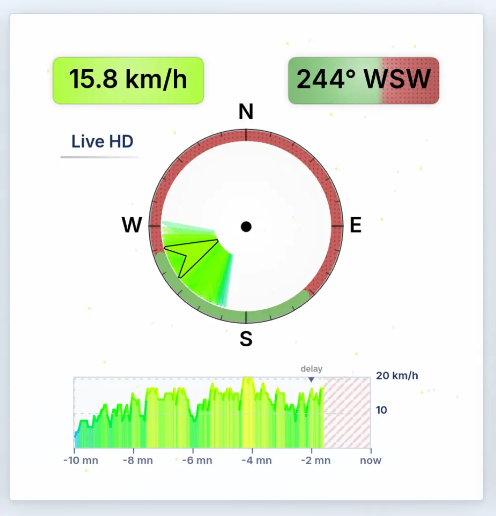
This is the station as it blows right now (or with a small broadcast delay, see below). It updates every 3 seconds.
What you see:
-
Speed badge (top left): the current wind speed. Its background color is the speed color, so a glance at the hue tells you as much as the number.
-
Direction badge (top right): current direction in degrees + compass point. On spot-aware stations its background shades green/red depending on whether the wind is currently in a good sector. When the direction sits near a sector edge, the badge is split, showing you're borderline.
-
The compass: the big arrow is the current direction. The faint colored arrows fanned around it are every measurement from the last 10 minutes: a tight fan means steady direction, a wide fan means shifty wind. Each faint arrow keeps the color of its own speed, so you can also spot "the gusts come from slightly more west" patterns.
-
Drifting particles: the specks flowing across the card move with the current wind speed and direction. They're an ambient cue: the harder it blows, the faster they stream.
-
The mini graph: the last 10 minutes of raw measurements, newest at the right (
now), colored by speed. Two special markings:- Red diagonal hatching = no data received for that stretch.
- A dashed vertical line labeled "delay" = the live playback point. Live data is deliberately replayed a short moment behind real time so it flows smoothly; everything left of the marker has been "played", the hatched sliver right of it is still on its way.
If the card shows "live not available": the station hasn't streamed for more than 10 minutes. The rest of the page (summaries, day chart, history) still works with whatever the station last reported.
2. Last 10 minutes / Last 1 hour summaries
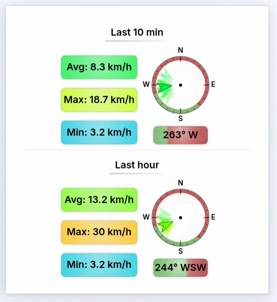
These two panels answer "what has it actually been doing lately?"
Each panel (10 minutes / 1 hour) shows:
- Average: the mean wind over the period. This is the number to trust for "how strong is it really".
- Max: the strongest gust in the period. The gap between average and
max is your gustiness warning:
avg 15, max 35is a very different day fromavg 15, max 18. - Min: the deepest lull. Useful when you need the wind not to drop; it's also a hint of thermal activity, since passing thermals can momentarily slow the wind down.
- A compass with the period's mean direction as the main arrow, and smaller ghost arrows showing how the direction moved within the period: the 10-minute panel breaks it into 1-minute steps, the 1-hour panel into 5-minute steps. Ghosts spread wide = the wind has been swinging.
- A direction badge with the mean direction, green/red on spot-aware stations.
If you see "data outdated": the station hasn't reported for over 30 minutes; the panel tells you how long ago the last record was instead of showing stale numbers.
3. Today's wind (day chart)
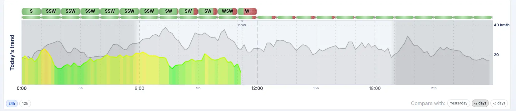
A one-look summary of the whole day, in the station's local time. Each point is a 10-minute average, colored by its speed, so a day that started calm (gray/cyan) and picked up (green/yellow/orange) reads like a story.
How to read it:
- The colored curve is the average wind through the day. Holes in the curve are periods with no data (nothing is invented to bridge outages).
- The badge strip above the chart shows the wind direction through the day, one badge per half-hour or hour. On spot-aware stations the strip is effectively a timeline of "when was the direction right": scan for the green stretches.
- Gray shading at the edges is night: before sunrise and after sunset at this station's actual location. Thermal spots wake up and die with the sun, and the shading makes that instantly visible.
- The dashed "now" line marks the current time; the curve right of it is still to come.
- Hover (or touch) the chart for exact values: time, average, max and direction of the nearest 10-minute record.
Controls (bottom corners):
24h/12h: the 12h view zooms into 06:00–18:00, the part of the day most people actually care about, with a finer direction strip.- Compare with: yesterday / 2 days ago / 3 days ago: overlays the chosen day as a gray curve behind today, with its own slim direction strip. Great for "is today building earlier than yesterday?" during a stable weather pattern. Click the active button again to turn it off.
4. The history graph
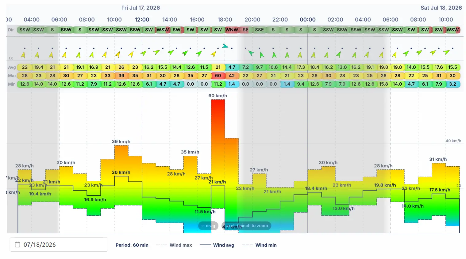
The archive. Everything the station has ever recorded, on one canvas you can drag to scroll and scroll / pinch to zoom: from months at a glance down to minute-by-minute detail.
The top band shows, for each time slot:
- Dir: a direction badge (green/red on spot-aware stations),
- an arrow pointing downwind, colored by the average speed,
- Avg / Max / Min: three speed badges.
The lower area shows the same numbers as curves:
- the solid line is the average,
- the upper dashed line is the max (gusts): the colored area under it is tinted by the speed scale, so strong periods glow warm colors,
- the lower dashed line is the min (lulls),
- peak values are labeled directly on the curve at local highs and lows,
- gray columns are nights, and the vertical lines mark midnight (solid), noon and intermediate hours,
- hover any point for a card with the exact time, avg, max, min and direction.
Detail adapts to zoom. Zoomed out, each column is a 3- or 6-hour summary; zoomed all the way in, you're looking at 1-minute records. The legend under the graph always tells you the current resolution ("period: N mn").
Extras:
- Date picker (below the graph): jump straight to any date instead of scrolling there.
- Temperature / Pressure buttons (above the graph, only on stations whose sensor reports them): overlay those measurements as extra lines, each in its own fixed color matching its button.
5. The windrose
This view and the daily pattern (below) will appear as extra tabs next to the history graph.
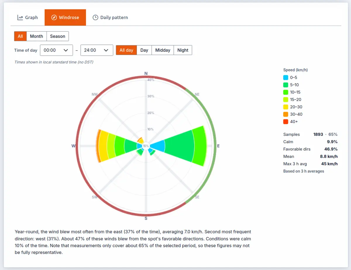
The history graph answers "what happened?"; the windrose answers "what is this spot like?" It condenses up to 8 years of records into one picture of where the wind comes from, how often, and how strong.
How to read it:
- The rose is split into 8 direction sectors. The longer a sector's wedge, the more often the wind blows from that direction; the rings give the scale in percent of all measurements.
- Each wedge is stacked by speed: the colored segments (see the legend) show how the strength is distributed when the wind is in that sector. A long wedge made of gray/cyan segments is a frequent but weak direction; a shorter wedge with orange/red segments is rarer but strong.
- The green and red band around the rose marks the spot's favorable wind directions, in the same colors as the compass and the arrows elsewhere on the page. It tells you at a glance whether the long wedges land in the green: a dominant direction sitting in a red arc means plenty of wind, but rarely from a direction you can use. The band appears only on stations whose owner has set favorable directions.
- The small disc in the center is calm air (too light to have a direction), with its share in percent.
- Hover or tap a sector for its exact numbers: frequency, mean speed and the strongest 3-hour average ever recorded from that direction.
Make it answer your question. The filters above the rose slice the history:
- Period: the whole record, a single month, or a season (seasons follow the station's hemisphere).
- Time of day: presets for day / midday / night or a custom window in 3-hour steps. "Does it blow in June?" and "Does it blow on June afternoons?" often have very different answers, and this is how you ask the second one.
The stats panel beside the rose carries a "Favorable dirs" figure — the share of the non-calm wind that blew from the green arcs. It is the one number for "how often is this spot actually on?", and because it follows the filters, you can compare two months or two seasons just by switching period.
Below the rose, a plain-language summary states the dominant direction, its share and mean speed, the runner-up direction, the favorable share, the calm share, and how much data backs the answer. Take the picture with a grain of salt when the coverage figure is low.
A note on time: the time-of-day filter uses the station's standard time (no daylight saving), so "afternoon" means the same solar hours in January and July.
6. The daily pattern
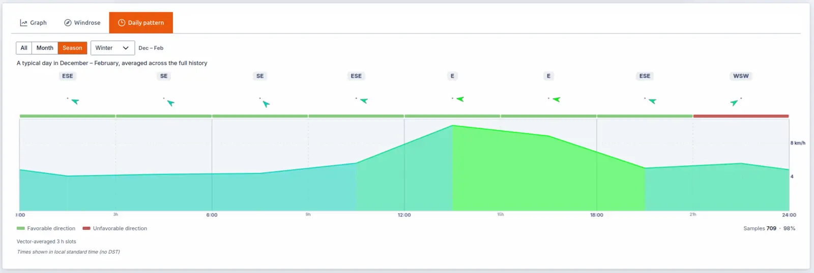
One average day at this station: what the wind typically does at each time of day, distilled from the same multi-year history as the windrose. On thermal spots this is the "when should I show up?" chart: you can see the breeze switch on mid-morning, peak in the afternoon and die at sunset.
How to read it:
- The day is divided into 3-hour slots. The colored curve is the typical wind speed through the day, colored by speed like every other chart (read the values off the right-hand axis).
- The arrows across the top show the typical direction for each slot, and
a labelled badge above each arrow spells out the compass point (e.g.
NW,SSW). On spots with a daily reversal (sea breeze / land breeze, valley winds) you'll see them flip through the day. - When the spot has favorable wind directions set, a green/red ribbon under the arrows flags whether each slot's typical direction is a good one.
- Below the chart, Samples shows how much data backs the average, with a
coverage % beside it (e.g.
Samples 4,182 · 71%). The percentage is how much of one full instance of the selected period your measurements add up to: under 100% means there are gaps in the record, well over 100% means several years overlap. Hover it for a reminder. - The Period filter (all / month / season) works like the windrose's: compare the summer pattern against winter, or check whether the afternoon thermal exists at all in October.
Like the windrose, hours are in the station's standard time, so the pattern is comparable across the whole year.
Quick reference
| Question | Where to look |
|---|---|
| Is it windy right now? | Live view: speed badge |
| Is the direction right for my spot? | Any green/red badge or the compass ring |
| Is it gusty? | Summaries: gap between max and min; compass ghost-arrow spread |
| Has it been holding for the last hour? | "Last 1 h" summary panel |
| When did it pick up today? | Day chart: where the curve changes color |
| Is today shaping up like yesterday? | Day chart: "Compare with" |
| What did last weekend look like? | History graph: date picker |
| Which direction does it usually blow here? | Windrose: longest wedge |
| Is this a winter or a summer spot? | Windrose: season filter |
| What time does it usually pick up? | Daily pattern: where the curve rises |
| Was that gap real calm or a dead sensor? | Hatched stripes (live graph) / holes in the curve (day & history) mean no data, not zero wind |